The payment form is a frame of Fluveo's, so the CSS of your page does not reach it. Its look is set in code, with the appearance option of fluveo.elements(): a theme, the variables that each change one value of it, where the labels go, how the fields join and whether the form animates. Every part is optional. Payment Element explains the form itself.
Themes#
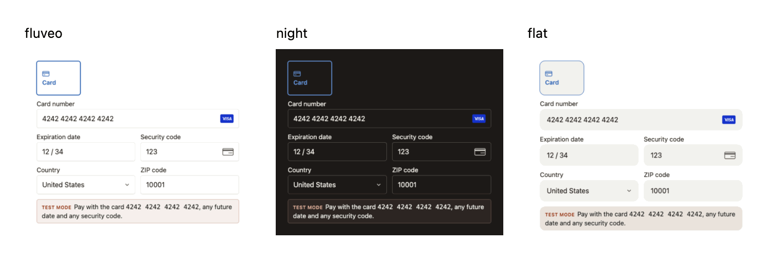
A theme is a whole look with a name: every color, corner, border and shadow of the form at once. theme takes three names, and the form has "fluveo" when you pass none. Pick the theme that suits the background of your page, then change single values with variables.
Each photograph on this page was taken with a test key, so it shows the test mode line under the fields.
fluveo
The default, for a light page: light fields with a thin border and a soft shadow.
const fluveo = Fluveo("pk_test_...");
const elements = fluveo.elements({
  clientSecret,
  appearance: { theme: "fluveo" },
});
const paymentElement = elements.create("payment");
paymentElement.mount("#payment-element");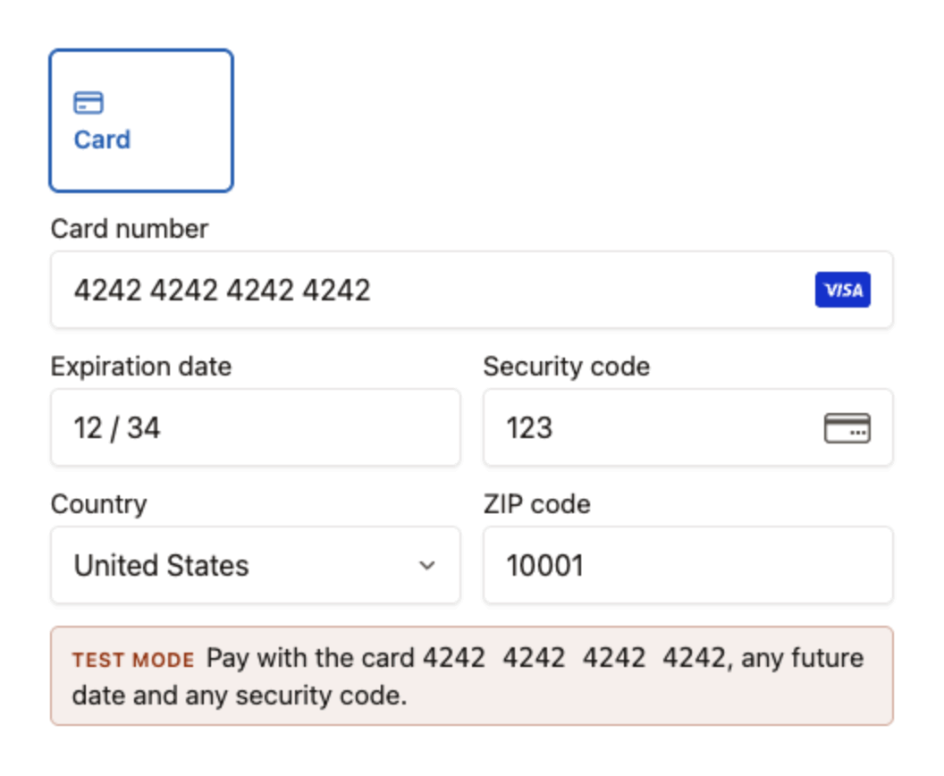
night
For a dark page: dark fields with light text. The photograph shows it on a dark background.
const fluveo = Fluveo("pk_test_...");
const elements = fluveo.elements({
  clientSecret,
  appearance: { theme: "night" },
});
const paymentElement = elements.create("payment");
paymentElement.mount("#payment-element");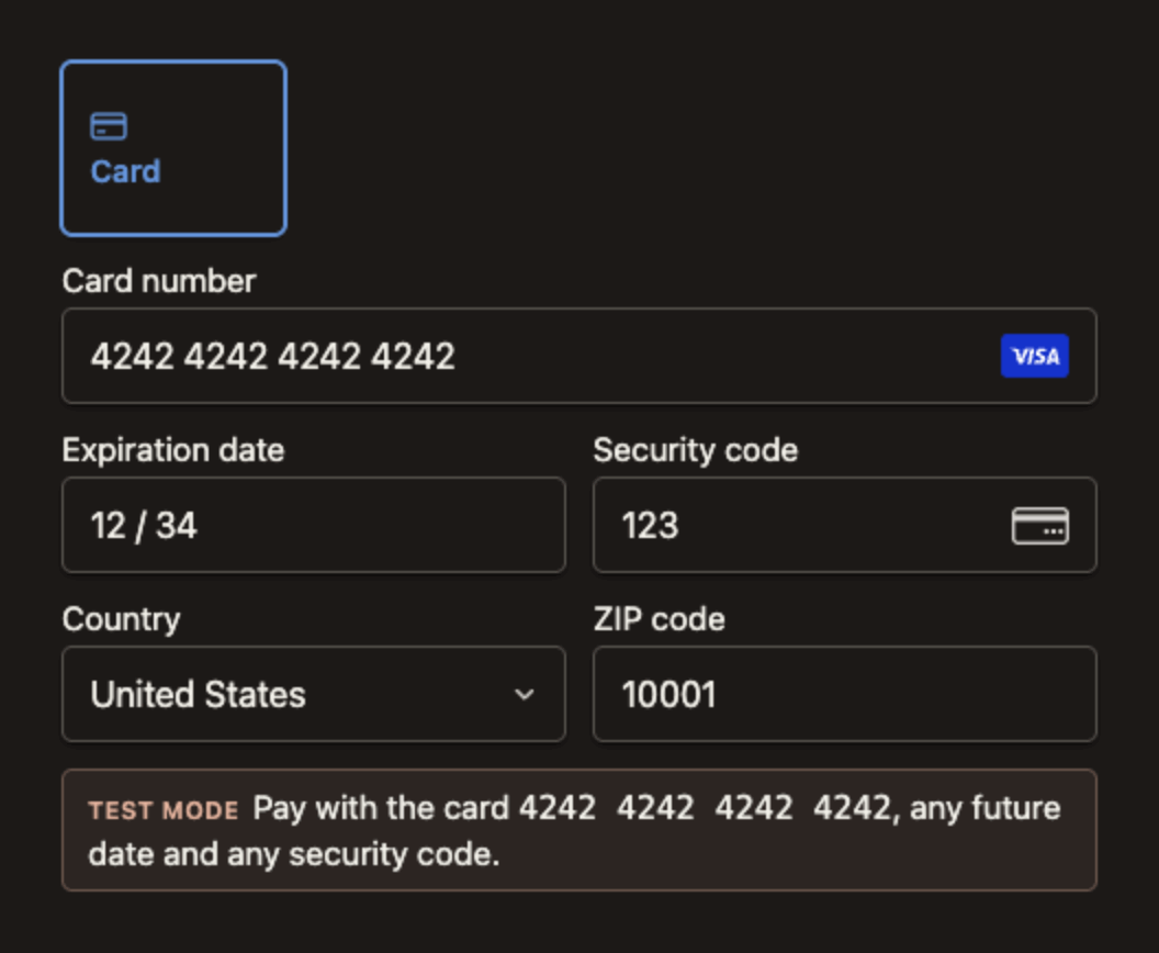
flat
Filled fields with no border and no shadow, taller and with rounder corners.
const fluveo = Fluveo("pk_test_...");
const elements = fluveo.elements({
  clientSecret,
  appearance: { theme: "flat" },
});
const paymentElement = elements.create("payment");
paymentElement.mount("#payment-element");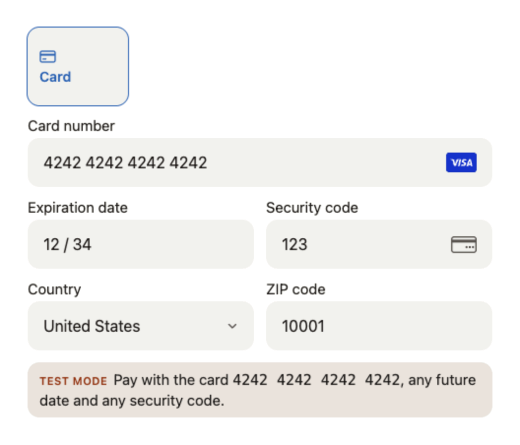
Variables#
A variable changes one value of the theme, and every part of the form that uses that value follows it. A variable you leave out keeps the theme's value. Each value is a text, written as CSS writes it, of the variable's kind: a color, a length or a font family. The reference lists each variable's kind.
colorPrimary: the outline and the ring of the field in focus, the selected tab, and the open row of an accordion with its radio button.colorBackground: the surface of the fields, the tabs and the accordion rows. The labels and the error lines sit on your own page.colorText: what the buyer types, and a label above its field.colorTextSecondary: a tab that is not selected, a floating label and the icons inside the fields.colorTextPlaceholder: the placeholders.colorDanger: an error line, and the outline of the field it is about.fontFamily: the font of the form's labels, tabs, fields and messages.fontSizeBase: the size that the labels, the tabs and the error lines are worked out from.spacingUnit: the padding inside the fields and the tabs, and the gaps between them.borderRadius: the corners of the fields, the tabs and the accordion rows.
const fluveo = Fluveo("pk_test_...");
const elements = fluveo.elements({
  clientSecret,
  appearance: {
    variables: {
      colorPrimary: "#0f766e",
      colorBackground: "#e0f2f1",
      spacingUnit: "4px",
      borderRadius: "10px",
    },
  },
});
const paymentElement = elements.create("payment");
paymentElement.mount("#payment-element");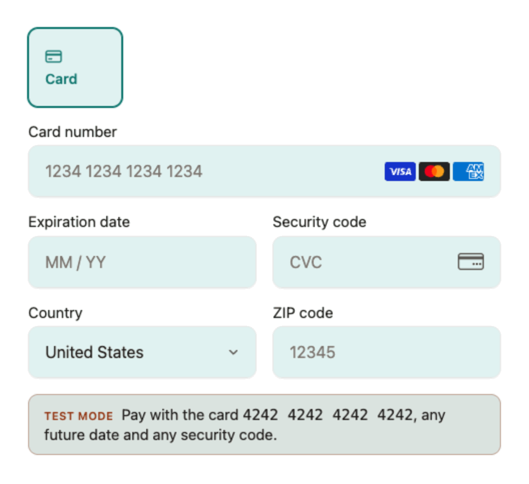
The default of each variable in each theme:
| Variable | "fluveo" | "night" | "flat" |
|---|---|---|---|
colorPrimary | #2961b2 | #6494db | #2961b2 |
colorBackground | #ffffff | #1c1917 | #f2f2ee |
colorText | #1c1917 | #f4f2eb | #1c1917 |
colorTextSecondary | #57534d | #d6d3d1 | #57534d |
colorTextPlaceholder | #79716b | #a6a09b | #57534d |
colorDanger | #c03f34 | #de8d87 | #c03f34 |
fontFamily | system-ui, -apple-system, 'Segoe UI', Roboto, 'Helvetica Neue', Arial, sans-serif | system-ui, -apple-system, 'Segoe UI', Roboto, 'Helvetica Neue', Arial, sans-serif | system-ui, -apple-system, 'Segoe UI', Roboto, 'Helvetica Neue', Arial, sans-serif |
fontSizeBase | 16px | 16px | 16px |
spacingUnit | 2px | 2px | 2px |
borderRadius | 5px | 5px | 12px |
Labels#
labels says where the label of each field goes.
"above": over its field."floating": inside its field. The label rests where the placeholder would be, so the form draws no placeholder, and it moves to the top of the field when the field takes the focus or holds a value."auto", the default: floating with condensed inputs, above with spaced ones.
const fluveo = Fluveo("pk_test_...");
const elements = fluveo.elements({
  clientSecret,
  appearance: { labels: "floating" },
});
const paymentElement = elements.create("payment");
paymentElement.mount("#payment-element");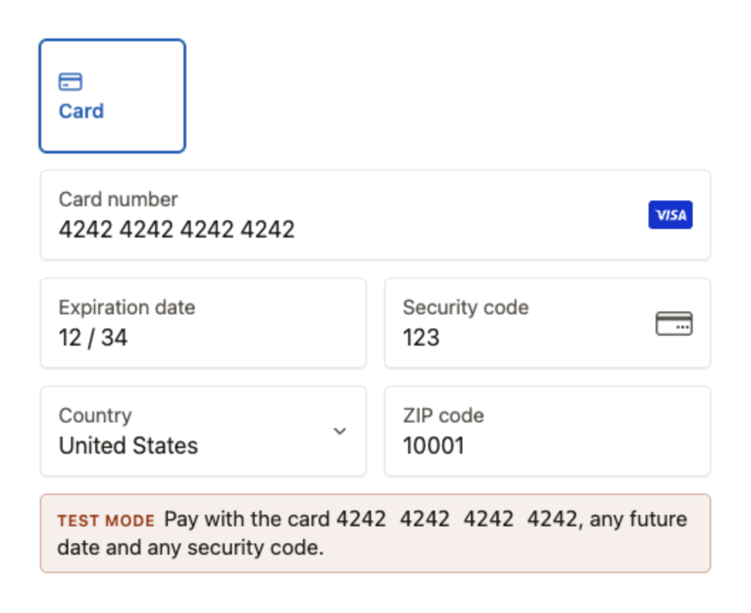
Inputs#
inputs says how the fields sit together. With "spaced", the default, each field is a box of its own. With "condensed" the fields are joined in one block, with one line between two of them in the themes that draw a border, and the lines that say what is wrong show under the block, as Errors describes. Labels left at "auto" float in a condensed block.
const fluveo = Fluveo("pk_test_...");
const elements = fluveo.elements({
  clientSecret,
  appearance: { inputs: "condensed" },
});
const paymentElement = elements.create("payment");
paymentElement.mount("#payment-element");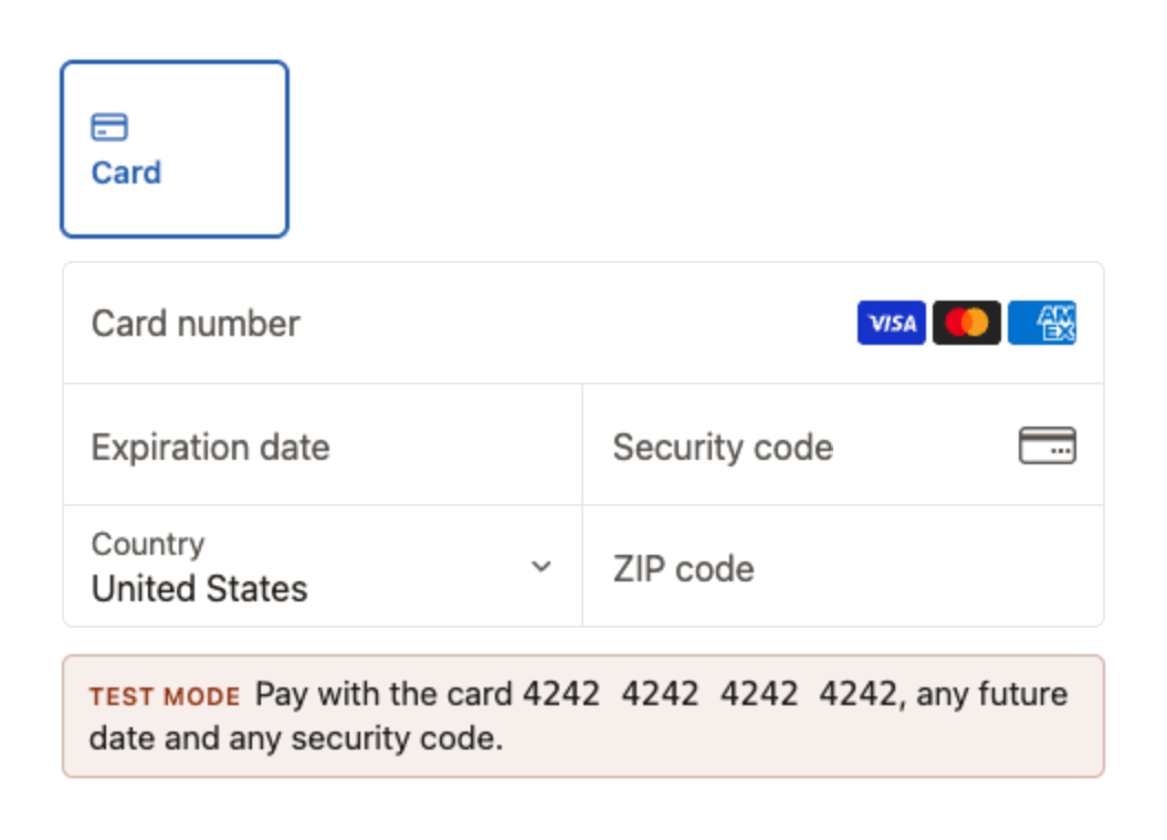
Animations#
The form moves a little: a field changes state over a short moment, a floating label slides to its place, the loading placeholder shimmers and the form fades in over it. disableAnimations: true stops all of it. The form also stops by itself for a buyer whose device asks for reduced motion, so set this only when your own page never animates.
const fluveo = Fluveo("pk_test_...");
const elements = fluveo.elements({
  clientSecret,
  appearance: { disableAnimations: true },
});
const paymentElement = elements.create("payment");
paymentElement.mount("#payment-element");
The text inside the card fields#
The card number, the expiration date and the security code are each a frame of their own inside the form, so the form's style does not reach them either. The form hands them four values of its look when it mounts, and again after each elements.update(): the font family, the text size, the text color and the placeholder color. So fontFamily, fontSizeBase, colorText and colorTextPlaceholder reach what the buyer types.
Two things to know. fontFamily names fonts the buyer's device has: the form loads no font file. And what the buyer types is never drawn smaller than the default fontSizeBase, so that a phone does not zoom the page in when a field takes the focus: a smaller base shrinks the labels, the tabs and the error lines only.
const fluveo = Fluveo("pk_test_...");
const elements = fluveo.elements({
  clientSecret,
  appearance: {
    variables: {
      fontFamily: "Georgia, serif",
      fontSizeBase: "18px",
      colorText: "#1e3a8a",
    },
  },
});
const paymentElement = elements.create("payment");
paymentElement.mount("#payment-element");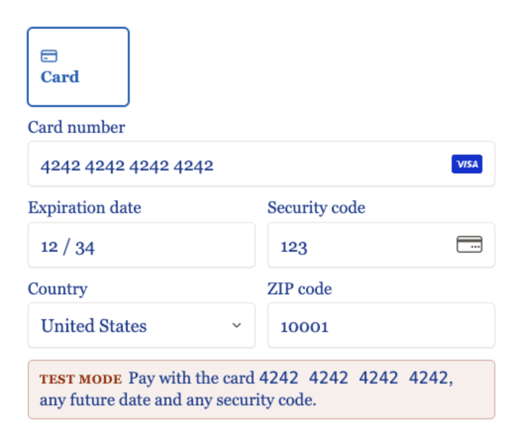
Change it live#
elements.update() changes the look of a form that is already on the page, with no reload: for a switch between a light and a dark page, or a preview of your own. Each call replaces the appearance whole, and a part the new object leaves out goes back to its default, so build the whole object each time.
const fluveo = Fluveo("pk_test_...");
const dark = window.matchMedia("(prefers-color-scheme: dark)");
const look = () => ({
  theme: dark.matches ? "night" : "fluveo",
  labels: "floating",
});
const elements = fluveo.elements({ clientSecret, appearance: look() });
const paymentElement = elements.create("payment");
paymentElement.mount("#payment-element");
dark.addEventListener("change", () => {
  elements.update({ appearance: look() });
});
What is refused#
Nothing is ignored in silence. A name or a value that appearance does not take throws a FluveoIntegrationError at the call, in fluveo.elements() and in elements.update() alike, and its message names what you passed.
| You pass | It throws |
|---|---|
An appearance that is not an object, or a name in it that the script does not know, such as colors | option_not_supported |
A theme, a labels or an inputs outside its list, or a disableAnimations that is not true or false | option_not_supported |
A name in variables other than the ten above | option_not_supported |
A variable's value that is not a text, such as the number 4 | appearance_value_invalid |
A color that CSS does not have, or var(), url(), inherit or currentColor in its place | appearance_value_invalid |
A length with no unit, other than "0", in a unit other than px, rem or em, or with more than three digits or two decimals | appearance_value_invalid |
A font family with a url() in it, or longer than 200 characters | appearance_value_invalid |
appearance in element.update() | option_not_supported: it goes to elements.update() |